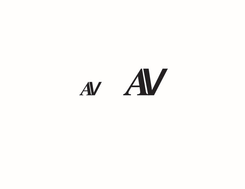
In my typography II class at Caldwell University, I was assigned to create a ligature with my first and last initial. The main objective was to assure that the design reads legibly and consistently in both the large and small sizes. I was mostly drawn to how the crotch of the V juxtaposed the negative space within the A. I chose Times New Roman for the 'A' and Franklin Gothic for 'V'.