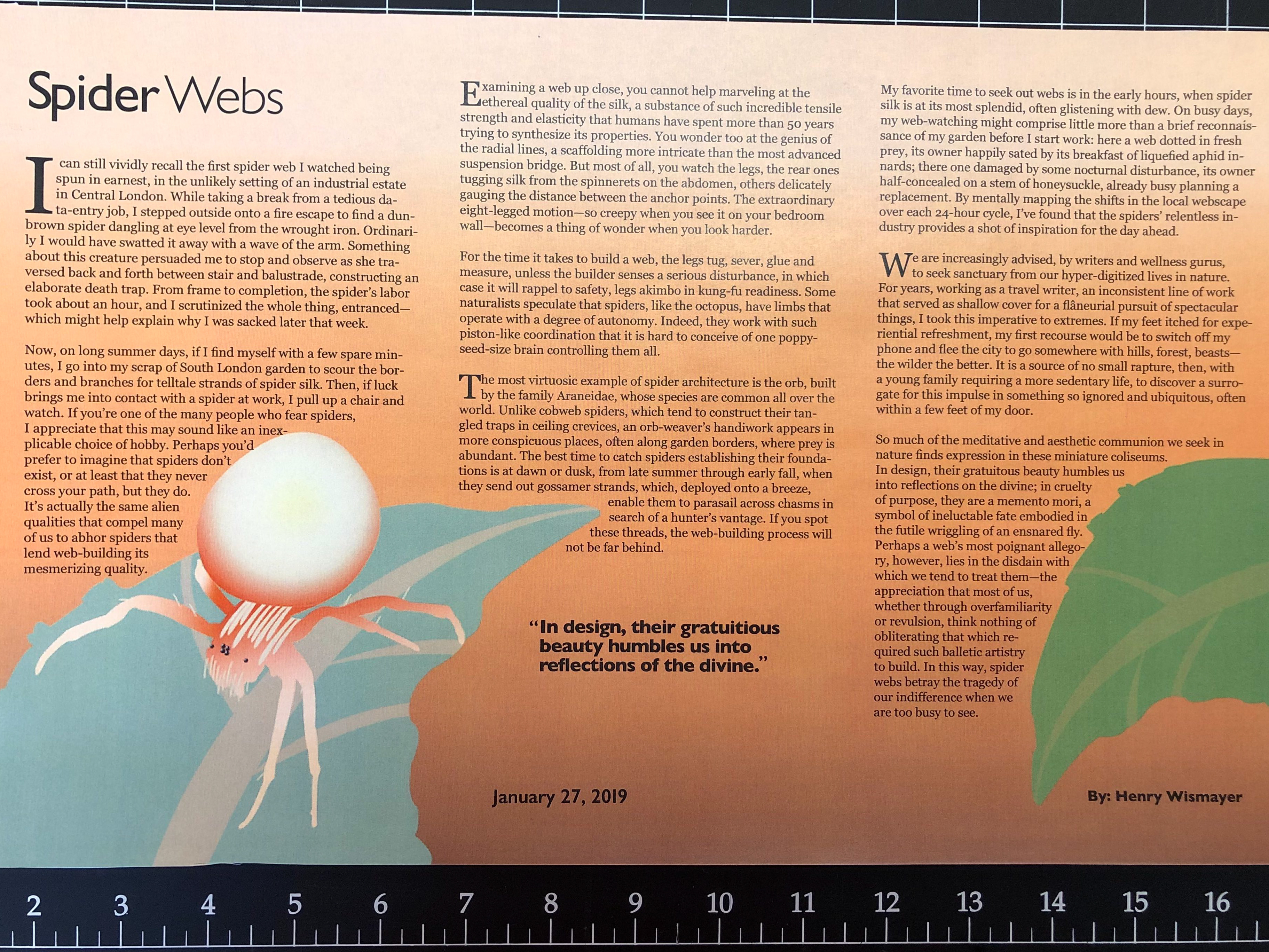
This was a project I made for my own amusement. I wanted to create a pattern on Adobe Illustrator that showed a gradation in color throughout the design. The prismatic yellow was very saturated, so I knew to feature less of it than the rest. The blue shapes remained the same value throughout, despite how the prismatic yellow darkened it in comparison to the muted yellows.
